In the times when manufacturers take care of their work’s quality, which becomes comparable in a given assortment – packaging and labels start to play an important role in product’s selling (Yep! Our society enriches itself and a ‘price does wonders’ phase is slowly going out of date, to the delight of the manufacturers’ majority that finally ‘goes all the way’). What counts is both the project and the label’s execution, and the totality positions a product on the shelf. It means that if any packaging seems to look significantly attractive or stands out from the rest, it is more likely for the consumer to take an interest in its content.
Let’s remember that a consumer by the shelf assesses the product in 7 seconds, and in 27 seconds does he make a decision to buy or not to buy. Over 70% of purchasing decisions are made by the shelf!
A label is a part of the packaging and it fulfills, or at least should fulfill 3 basic functions, which will be further described:
Informative aspect

Most of all, the label informs about the product. First and foremost, it has to contain every information, that are required by the law being in force for any given industry. It is also often for basic and essential information to be presented in many languages. For the label to remain attractive, despite a lot of information to be printed, a peel – off was created (“open-close” labels). Currently they are available in a 4-, 6- and 8-page labels. They could be very simple but they could also be created in fancy shapes and strongly refined, ex. by cold-stamping, metallic paints, soporific varnish etc. These are extraordinarily practical and economical (Yep! A peel-off may be economical) solutions, especially for companies exporting their products to many countries, because one does not need to print a few versions of labels in various languages, when you can print only one. If we don’t use it ex. in Japan, we can use it in Germany, because our volume of sales increased there.
Speaking of the informative role, one needs to be emphasised. The label should be readable, because a large group of consumers reads labels, or at least tries to read them. Not infrequently does a microscopic font size on a label effectively discourages the consumers from reading.
Dear manufacturers, there is a short plea for you – our society grows old and thereby his visual perception exacerbates. Not everyone carries a magnifying glass with them, so if you do not have anything to hide, look after a readable font size on your labels.
Visual aspect

It cannot be a coincidence that a word ‘etykieta’ (eng. label) exists in the Polish language in a feminine grammatical gender. Similarly to women, some labels encourage and entice by their appearance. It is just like in the Cinderella story – when she was a slattern, no one wanted to look at her. When she changed to an attractive lady, however, even the prince set his eyes on her J.
Of course, one shall not discuss someone else’s taste and what is beautiful for some might be completely dreadful for others. Nevertheless, there are a few general rules, that are worthwhile to remember:
- The first rule is brand’s consistency – it is worth investing in a graphic design created by professionals for the whole product line. I know, this seems to be pretty expensive. However, the individual cost will come out trifling, when you realize that a given design will be functioning for at least a couple of years. Moreover, the amount of printed labels throughout that time would favour the claim(to check it out, all you need is a calculator – divide projects’ costs by the estimated amount of labels printed in the upcoming 5 years, for example).
- The second rule is to consult the printing house during the label designing phase (a good printing house, of course, that likes challenges and helpsJ). One should do that in order to pick an appropriate material to print on, proper glue and refinement type. For example:
– a label for vegan products could be made of biodegradeable transparent foil obtained from sugar cane, structural paper or from wood;
– a label for beer or vodka may be refined by ‘frosted’ varnish imitating the effect of frostiness (sells’ increase during a hot summer guaranteed);
– a label for perfumes or cosmetics can smell like the product it represents (saporific varnish);
– a label on bottles and transparent products could have a print from the side of the glue. The result is only one label, which fulfills an informative role and visually attractive one too.
Consultations with the printing house will also allow to optimalise the costs of printing any given label (a print from the side of the glue, peel-off, thinner foils, PET linear, thinner papers, finer glue layer, a selection of proper glue, ex. to oily products; reduction of the amount of colours used and a limitation of the passages on the machine to one). Sometimes graphic designers create the absolute works of art on the computer screen, but they turn out to be impossible to print or horrendously expensive. Sometimes graphic designers do not know the materials and the solutions available in the printing industry. That is why it is worth talking to the printing house.
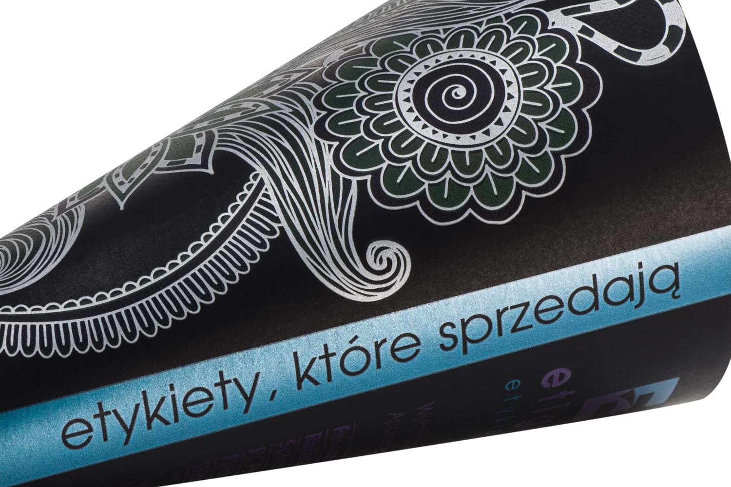
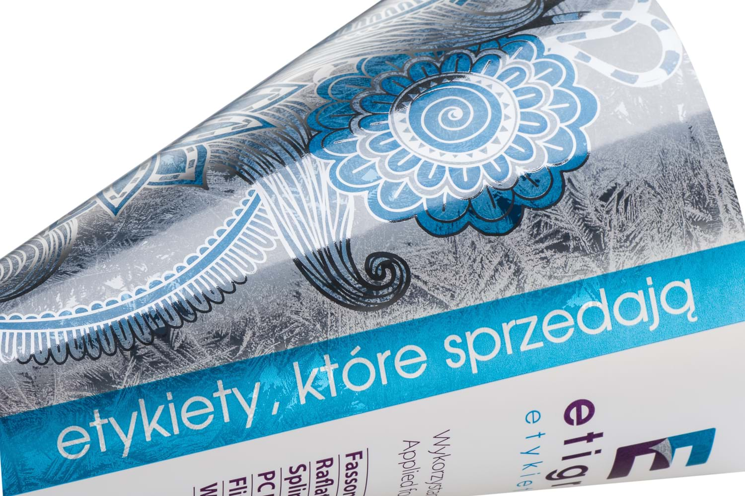
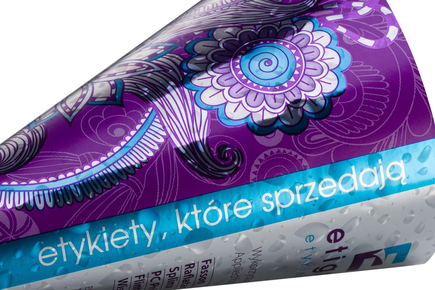
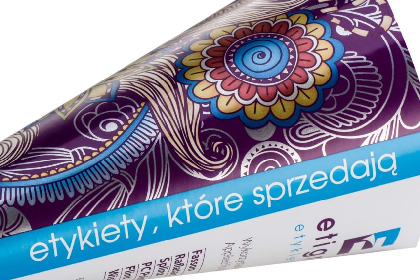
- The third rule is that sometimes, one does not have to change the project graphicly. Instead, one can change label’s appearance on the product by using various refinements. Below you can find a couple of pictures from our pattern book. There we have got the same graphic design, but every single label looks differently. You can find out more in our another article: ‘If not rebranding, then what else? How to change a product’s appearance without the graphical project?’)
While considering a topic of the visual role of the label, it is worth remembering that ‘Premium’ products should also have a ‘Premium’ packaging. Not only that, its every package oughts to reflect a given item’s value. There is competition in every single industry. Only those, who are seen on a shop shelf will win the race for consumers’ hearts.
Marketing aspect

The label is a good place for fun games with the consumer. Every means of engaging our consumer increases the sell, and that is what it is all about.
I’ll give you some examples that are more or less known:
- A peel-off label may contain changeable details inside. It might be a number or a QR code, under which there can be a hidden price for the consumer. There could also be an information that such consumer is the lucky owner of the 3rd out of limited 100 pieces of a given product.
- Labels can have printed changeable QR codes, letting the consumer – especially the youngest – enter the virtual reality. For example, a video clip hidden behind the QR code can tell a story about the technology of obtaining a special ingredient in a given chemical or cosmetic product. It could also present a region, out of which a given wine is originated etc.
- Labels may have an element covered with a scented varnish, which will always be associated with a given product, ex. a mint leaf printed on the label will smell like mint.
- Holograms – there are a lot of beautiful patterns for holographic foils, ex. imitations of the waterdrops (such hologram could ex. legitimise the authenticity of the moisturising cosmetics). The holograms underline the products’ uniqueness.
A label is an ad’s carrier for the product in the selling place. Which way of communication on a packaging will convince the consumer and sell the product? Only the one, which is reliable and offers benefits to the client. Untypical paint, a nice label’s texture or interesting print refinement effectively emphasises the information given on the packaging. Often does a little adjustment in the project on a packaging or label design, may have a significant, positive impact on the selling results. It is noticeable almost immediately after releasing the product on the market.
A packaging’s role has enormously increased over the years. A creative process behind new packaging and labels has become more complexed.
Nowadays, such process requires commitment of numerous specialists(including a creative graphic designer, a professional printing house and a print technologist) already during the phase of creating packaging’s conception.

